The July Effect That Wasn't
The "July Effect": Debunking the Myth That New Doctors Kill Patients

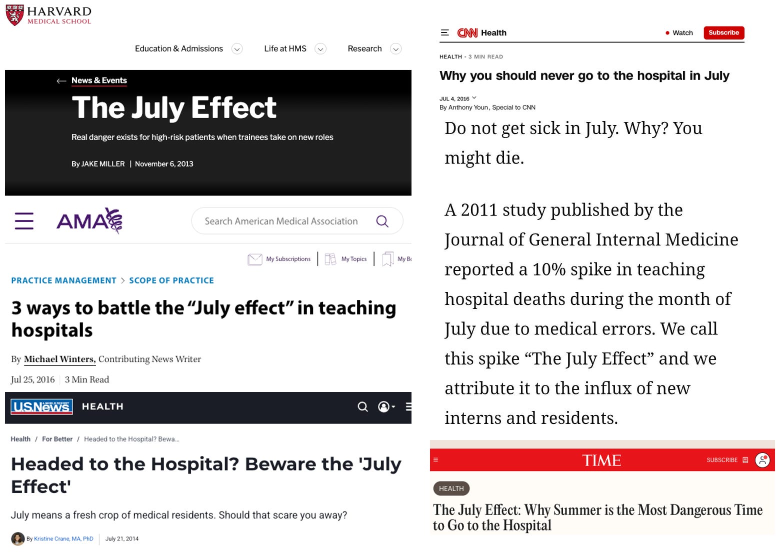
Every summer the same warning makes the rounds: “don’t get sick in July.” That’s when the newly minted doctors arrive, interns who finished medical school six weeks ago, senior residents bumped up into roles they’ve never held, entire teams reshuffled overnight. In the U.S. we call this the “July effect.” In Britain, more luridly, the “killing season,” or “Black Wednesday” for the first Wednesday in August when new trainees start. Intuitively, it makes sense: new people surely must make more errors, and more medical mistakes must mean more dead patients. But is our intuition correct? Despite this being one of the most durable beliefs in medicine, it is for all the outcomes that matter most, wrong.
It All Began With a Null Result
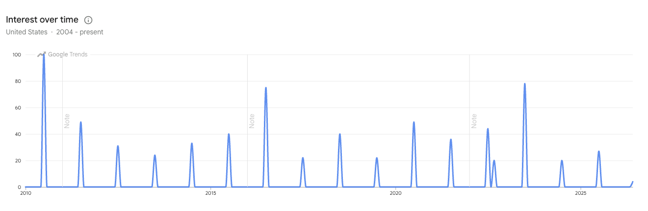
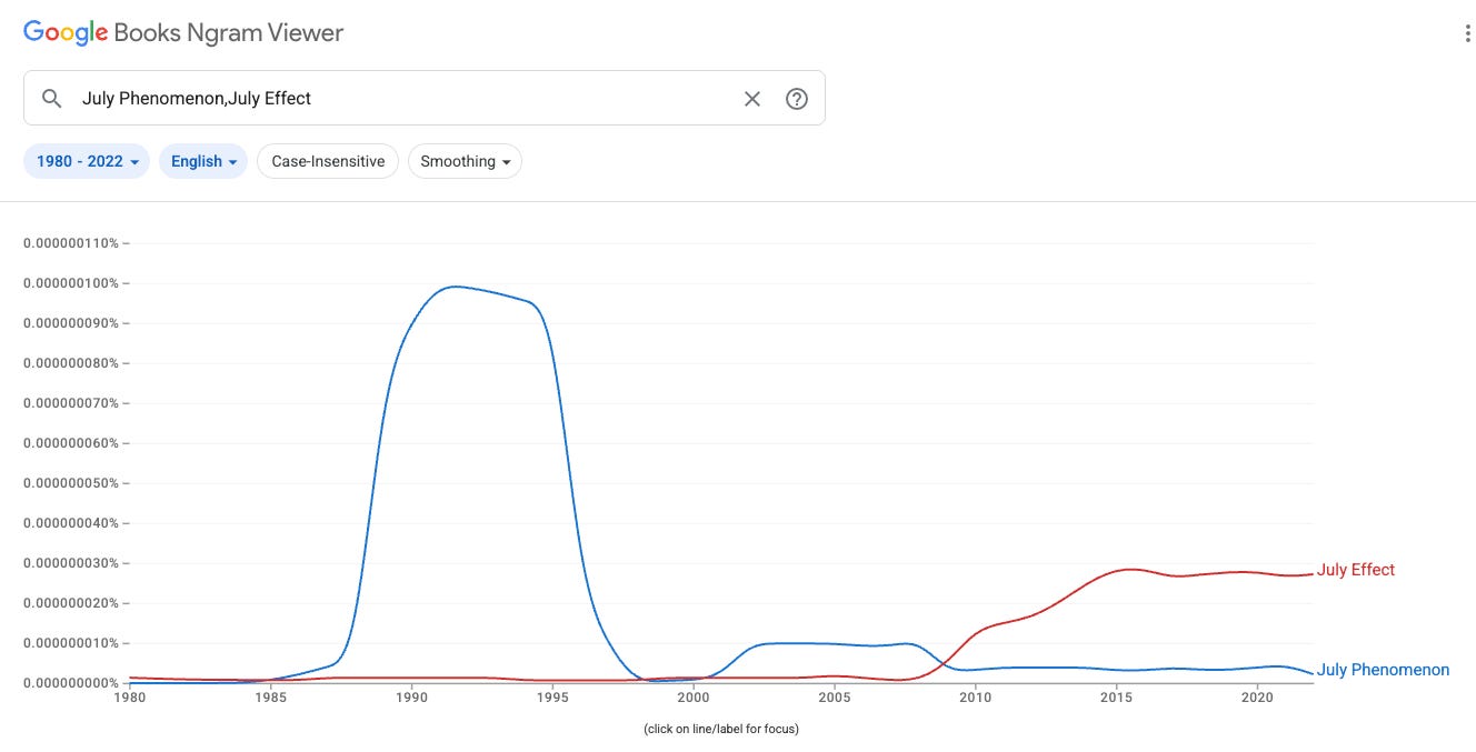
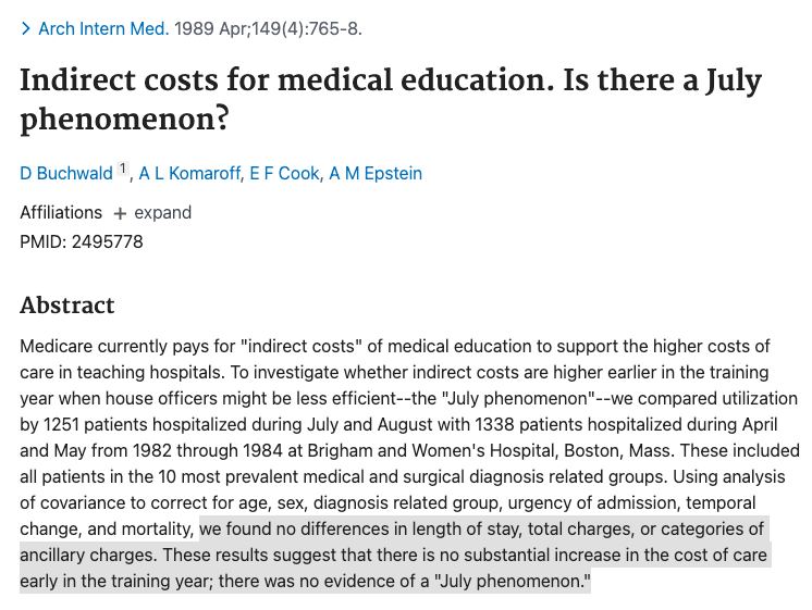
The first study of the “July Phenomenon” was undertaken by Buchwald et al in 1989, and looked at costs of care at a major teaching hospital early versus later in the academic year. It found no significant increase. Despite this negative result, the mechanism was too seductive to need evidence. Over the next fifteen years the “July phenomenon” seeped into the vocabulary of every teaching hospital in the country - passed along in orientation talks, nervous jokes on the wards, and the occasional cautionary op-ed - largely on the strength of how obviously true it felt. The name morphed into the more succinct “July Effect” but the sentiment remained unchanged: if you are a patient in July, be afraid.
Enter the Economists…
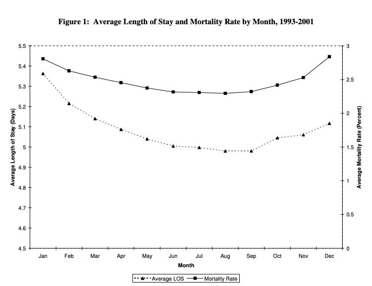
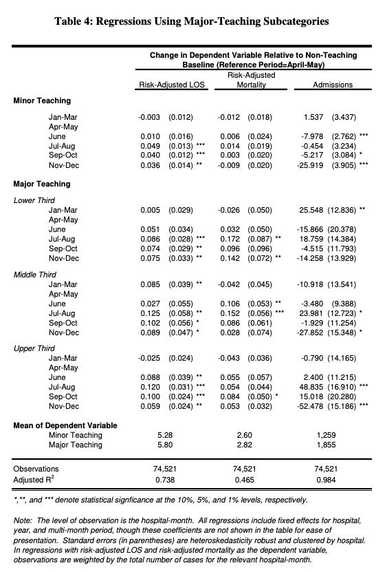
The folklore finally got some supporting evidence in 2005, when economists Huckman and Barro released a National Bureau of Economic Research (NBER) working paper titled Cohort Turnover and Productivity: The July Phenomenon in Teaching Hospitals. Using five years of admissions from a large multi-state hospital sample, they reported that teaching hospitals saw length of stay jump right after the July turnover and stay elevated for months, and that hospitals of medium teaching intensity showed a significant bump in mortality over the same window, on the order of a 4% rise in risk-adjusted mortality in July–August, translating to roughly 8 to 14 “accelerated” deaths per year at an average major teaching hospital.
If we examine the data more closely, several flaws are immediately obvious. Mortality and length of stay are lowest in July - exactly the opposite of what the “July Effect” would predict. The table that analyzes hospitals by degree of teaching is an exercise in p-hacking: only the middle third of major teaching hospitals saw a statistically significant increase. (This was just one of 20 groups analyzed for mortality, without correcting for multiple comparisons...) On the other hand, the hospitals with the highest teaching intensity, those most dependent on trainees, where the effect should have been worst, avoided the mortality bump altogether. The authors’ own read was that “higher supervision levels mitigated the disruption,” suggesting the effect was something a well-designed system could absorb.
Blaming the Doctors for the Weather?
In 2010 the “July effect” got even more evidence, leading to a surge of mentions in the popular press. Phillips and Barker examined every computerized U.S. death record over 28 years, focusing on fatal medication errors specifically, as an unambiguous marker of a serious mistake. They found that inside medical institutions, fatal medication errors spiked in July and in no other month, and this spike appeared only in counties containing teaching hospitals, where July medication-error mortality ran about 10% above expected. The more teaching hospitals a county had, the bigger the July spike.
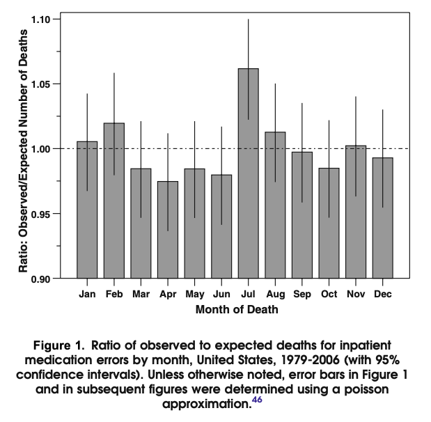
Superficially, this is a very worrisome finding. But once again, when we examine the methodology more closely major flaws are apparent. Interestingly, they found no change in fatal medication errors after 2003 when the first work hour restrictions were enacted, something we might expect to see since that’s exactly why work hours were implemented! More importantly, because the computerized death certificates did not include the precise location of death, they could not measure deaths in teaching hospitals, only deaths in counties that contained a teaching hospital. Because the nations 1400 teaching hospitals cluster in urban areas, this introduces a striking bias in the data: urban vs rural. We also need to closely scrutinize their definition: “fatal medication errors” was defined by ICD9 codes E850-E858. This does not attribute who was responsible - and in most cases reflected patient overdoses that occurred outside of the hospital and subsequently died after admission. It is well known that exposure to heat is associated with an increase in the risk of drug overdoses, and that months with greater temperature have more overdose deaths. Does this association between urban deaths in July reflect the doctors or just the weather?
Torturing the Data Until It Confessed
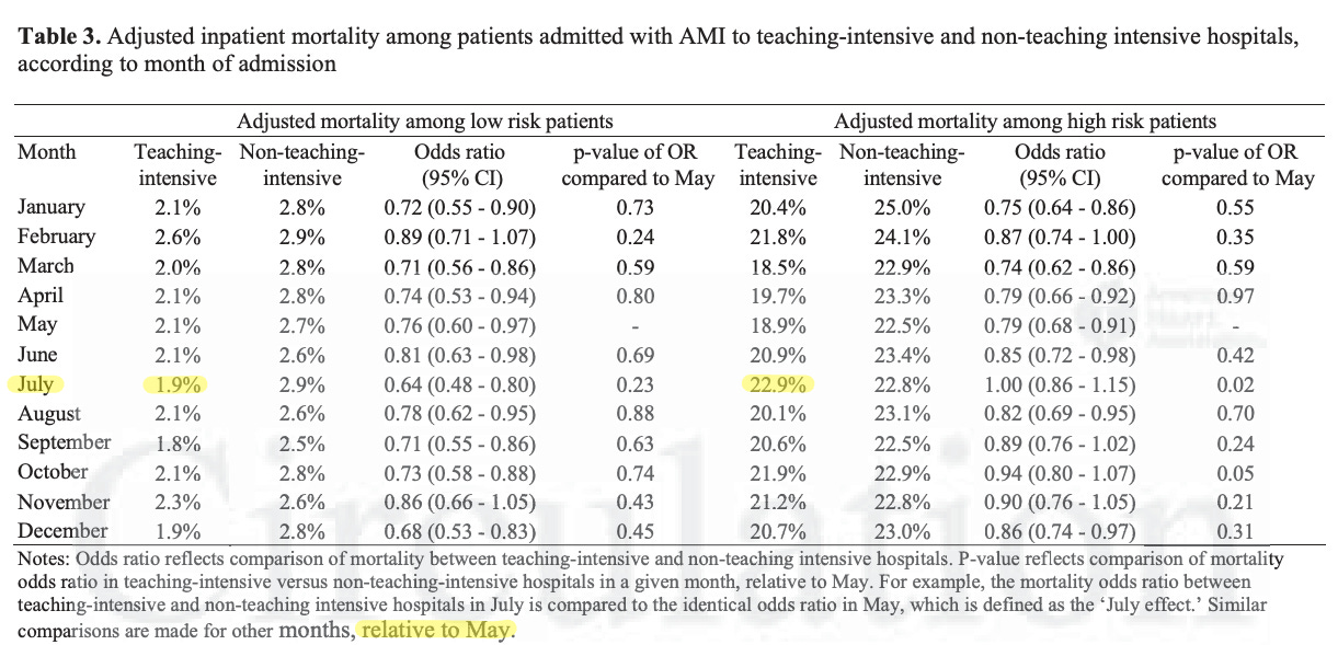
A few years later the “July Effect” got another boost, and another round of headlines. Jena and colleagues (2013) looked at high-risk acute myocardial infarction patients from the national inpatient sample from 2002-2008 and ran a difference-in-differences comparison of May versus July across teaching-intensive and non-teaching hospitals. Among the highest-risk heart-attack patients, mortality in teaching-intensive hospitals was 18.8% in May but 22.7% in July, while non-teaching hospitals showed no such May-to-July gap.
Once again, the devil is in the methodological details.
Why did they compare July with May and not with June? Because the effect isn’t significant if you do! Why did they only look at “high risk” patients? Not only does the effect go away, but July is a month with the lowest mortality for low risk patients; substantially lower than at a non-teaching hospital! If there really is a “July effect” wouldn’t we expect August to be almost as dangerous? In fact August is one of the safest months with one of the three lowest adjusted mortality rates. Once again, the authors make no attempt to correct for the 24 comparisons performed in just this figure:
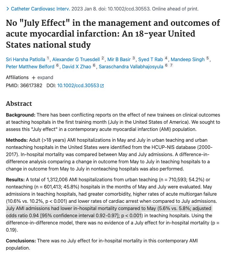
A decade later, in 2023, a different group revisited this question with 18 years of national data on heart-attack patients - a far longer and more contemporary window than the 2002–2008 slice Jena used. Using an much larger population (n=1.3 million admissions for acute myocardial infarction, compared to the 75,000 used by Jena et al) they found that July AMI admissions actually had lower mortality than those in May. The conclusion was blunt: there was no July effect for in-hospital mortality in this contemporary AMI population.
The same story has played out many times in the scientific literature. A small methodologically dubious initial study finds a weakly significant “July effect.” Despite the limitations the authors and their institution hype it up, and the media credulously publishes terrifying click-bait headlines. Meanwhile, larger and more rigorous studies fail to replicate the finding and get published in lower tier journals with much less fanfare. For example, several studies looking at condition specific outcomes, found null results where the effect should have been the loudest: no July effect in appendicitis, in trauma, in acute ischemic stroke, in acute cardiovascular management, or in mechanically ventilated ARDS patients.
Six Million Patients Later…
In 2023, Zogg and colleagues, put the myth to the test with a systematic review and random-effects meta-analysis of the entire literature, including every July-effect study published before December 2019. This totaled 113 studies of which 81% of them found no July effect. When they pooled the numbers, the “July Effect” disappeared:
Mortality: odds ratio 1.01 (95% CI 0.98–1.05).
Major morbidity: 1.01 (0.99–1.04).
Readmission across 5.98 million patient encounters and 7 conditions: no effect.
They found no signal by country, specialty, or condition. They found no change over time. The authors’ recommendation was essentially to stop running these studies and redirect the energy toward the year-round quality and efficiency problems that probably generate the perception of a July effect in the first place.
Why a wrong idea lived so long
The July effect had everything a medical myth needs. A mechanism that seemed intuitive and a permanent supply of confirmation bias: every bad outcome in July must be due to the “July effect” whereas the same outcome in June could be attributed simply to bad luck. It was buoyed by researchers who cut corners methodologically to sustain the myth, and health journalists who amplified it for clicks.
There are real costs to July. Academic centers do see a rise in length of stay, procedure times. But this may reflect the opposite cause: new interns are slower because they are more careful. Just like the 2005 NBER theorized: the system was built to absorb the shock, and the aggregate data says it largely does. So the next time someone tells you not to get sick in July, you can tell them the truth. The first study on the July effect found nothing. After three decades, millions of patients, and over a hundred studies we can say that definitively the “July Effect” is a myth.